
We Asked GPT-5.5 and Claude Opus 4.7 to Design 5 UIs

Both OpenAI and Anthropic shipped their frontier coding models this month: GPT-5.5 on April 23, 2026, and Claude Opus 4.7 a week earlier on April 16.
Two days after the GPT-5.5 launch, Sam Altman tweeted this:
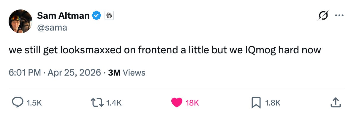
For those of us who don’t speak fluent Gen Z, that translates to: GPT-5.5 has the brains but Claude still has the taste. That “a little” is doing a lot of work in that sentence, and we wanted to see what it actually looks like in practice.
We gave both models the same five UI design prompts (a SaaS landing page, an analytics dashboard, a settings page, a sign-up screen, and a pricing page), and asked each to produce a single self-contained index.html using Tailwind via CDN.
TL;DR: Claude Opus 4.7 produced more polished UIs across all five tasks. Its outputs feel closer to a real product. GPT-5.5’s outputs work and look okay, but they read more like Tailwind UI starter templates than custom designs.
Pricing
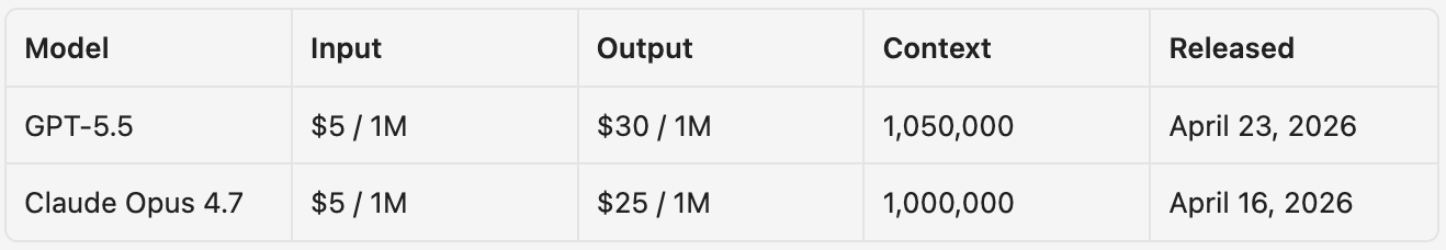
Same input cost. GPT-5.5 output is 20% more expensive ($30/M vs $25/M).
Our Setup
We ran both in Kilo CLI in Code mode at high reasoning. Each task started in its own empty directory with no shared state. The prompts were vibes and minimum content style: we named the product, listed required content, and left every visual decision to the model.
For example, the landing page prompt:
Design a premium landing page for a fintech startup called Velora. The product is a treasury management platform for venture-backed startups (think “Mercury for Series A and B companies”). The page should feel like Linear, or Stripe tier polish.
Required content: a hero (headline, subhead, primary CTA, secondary CTA), a customer logo bar with 6 logos, a feature section with at least three product pillars, social proof or stats, one CFO testimonial, a pricing teaser, and a footer with navigation.
Output a single self-contained index.html. Use Tailwind via CDN. Make every design decision yourself.
Both models received identical prompts. We did not iterate, and the screenshots in this post are one-shot outputs.
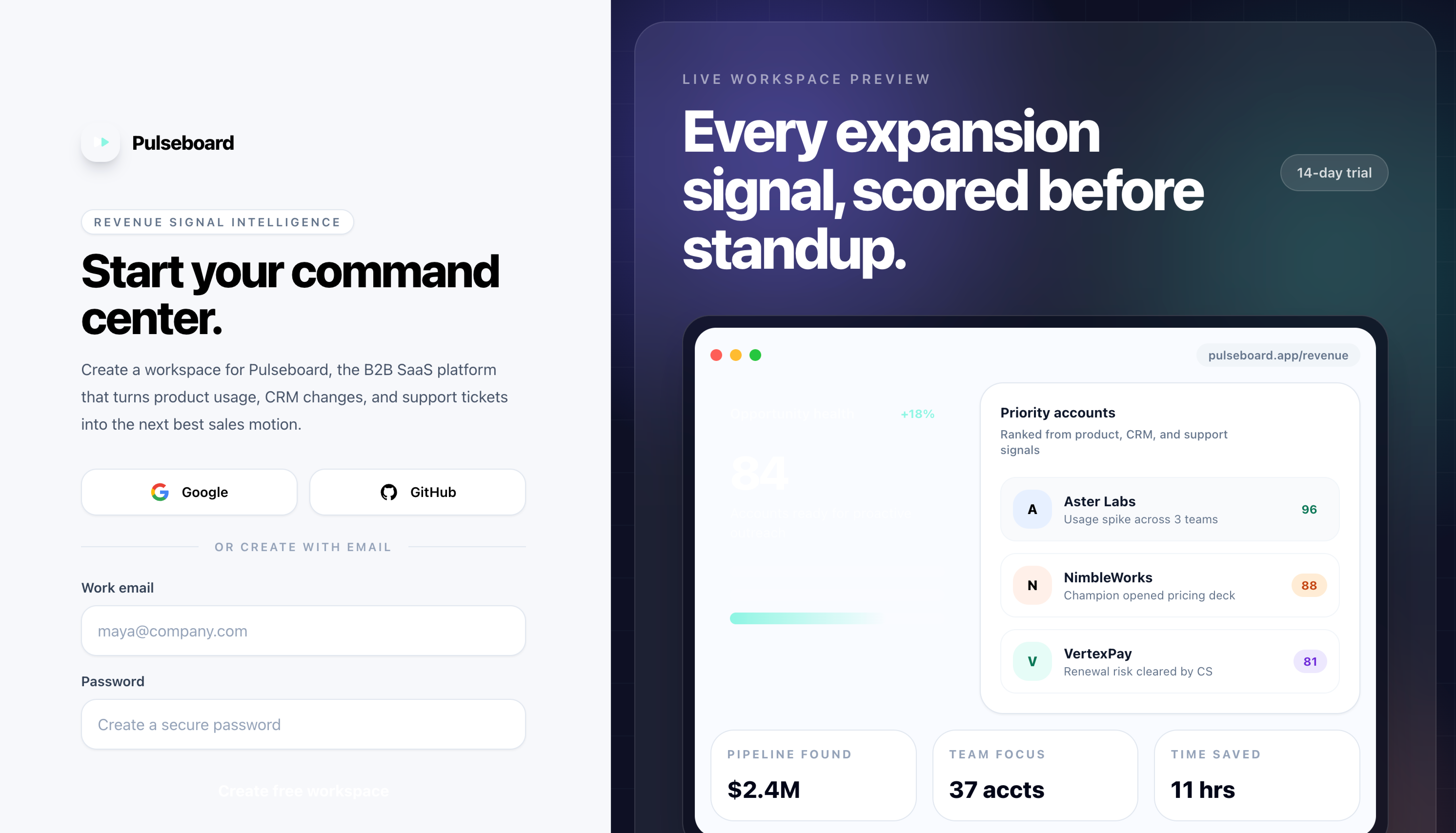
Task 1: SaaS Landing Page
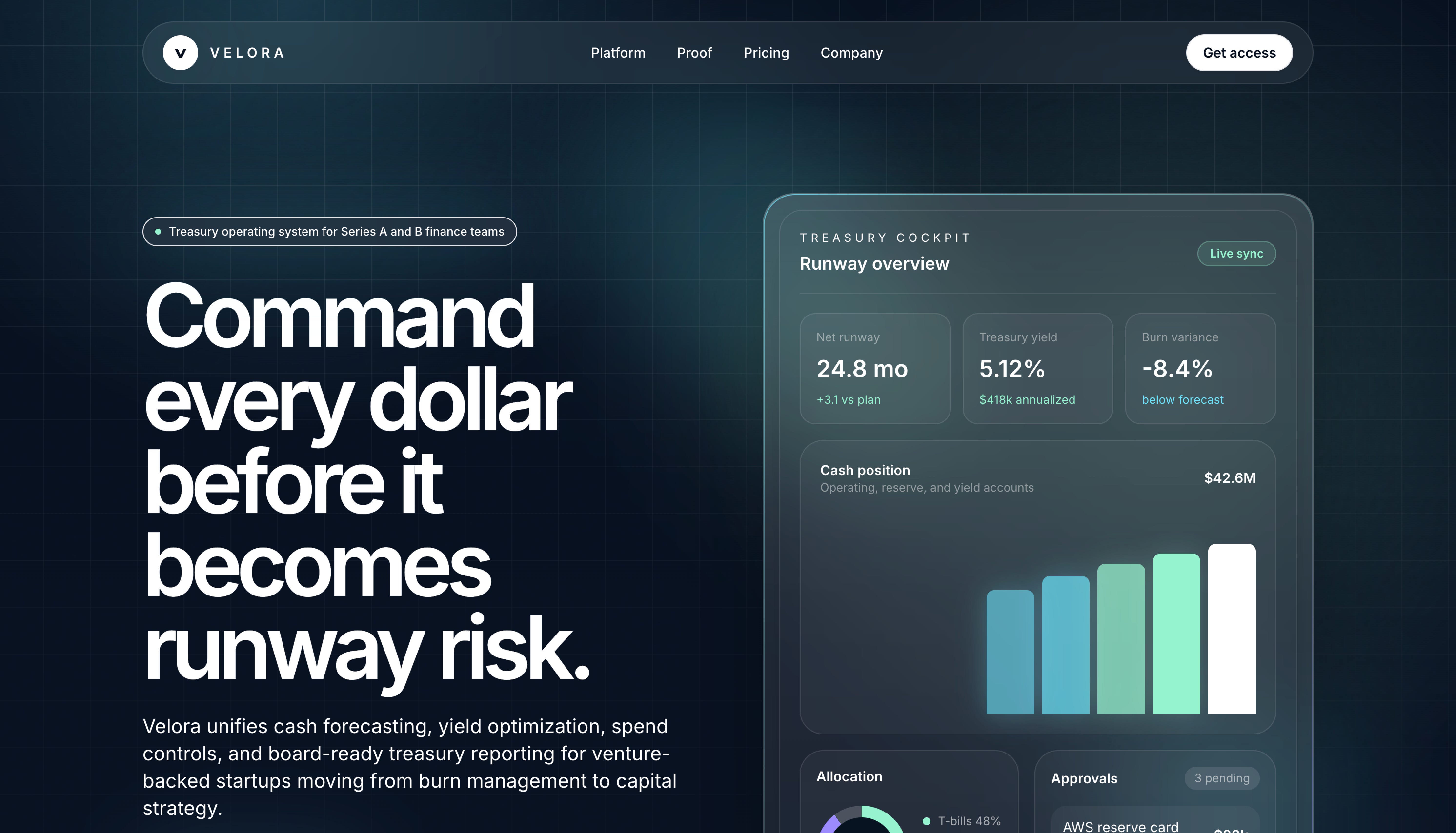
GPT-5.5 went with a dark dev-tool look: massive left-aligned headline (it’s huge), product preview card floating to the right, gradients on the metric widgets. The headline reads “Command every dollar before it becomes runway risk.” It reads as a modern SaaS landing page, but the composition is one we’ve all seen before.
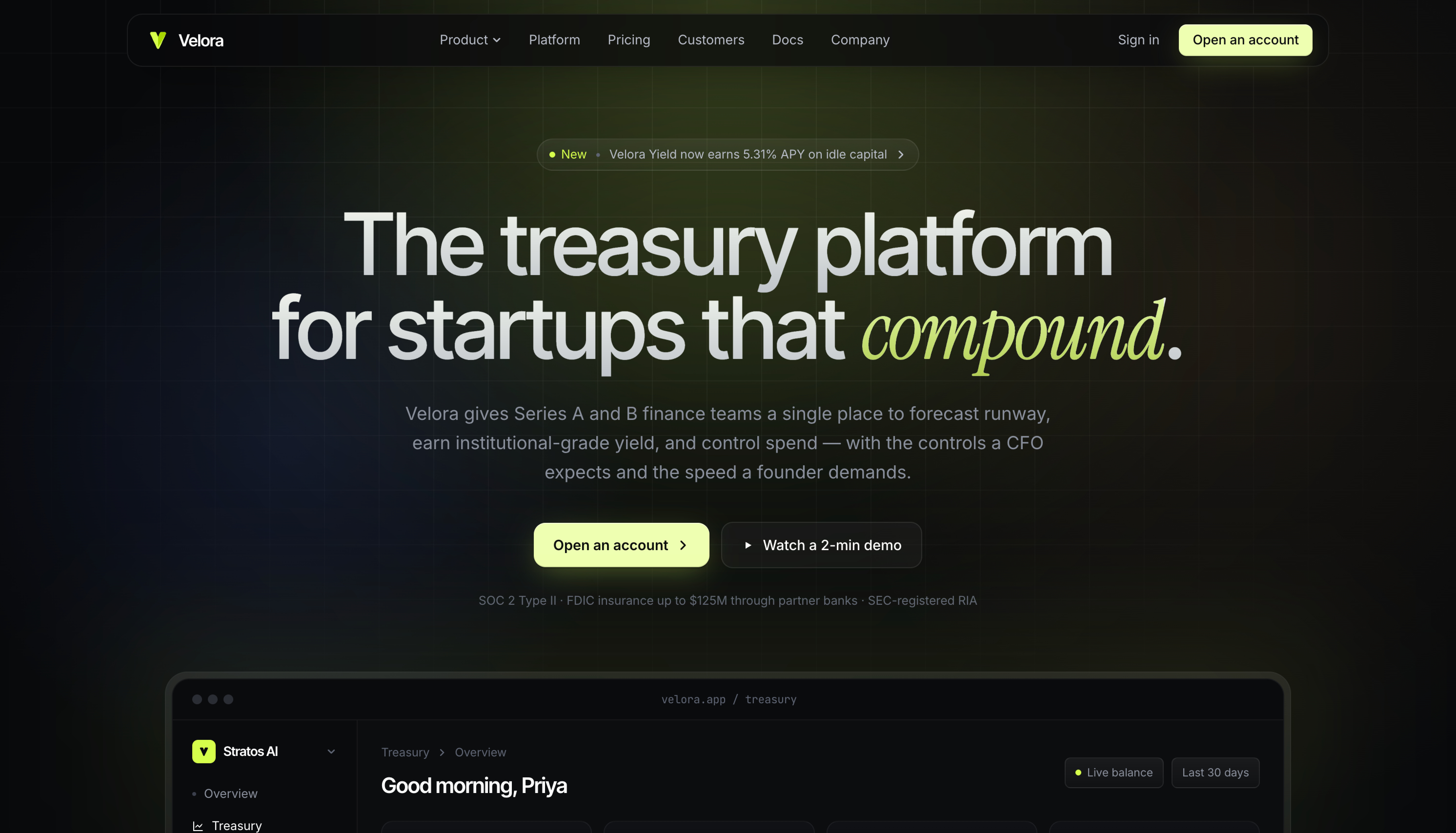
Claude Opus 4.7 chose a centered hero (”The treasury platform for startups that compound.”) and paired its sans-serif with an italicized serif accent on the word “compound.” It picked a more specific palette (warm charcoal with a chartreuse accent) and tucked SOC 2 / FDIC compliance text directly under the CTA. The product mockup sits below the fold rather than competing with the hero.
GPT-5.5’s hero also missed a prompt requirement. The prompt asked for a primary and secondary CTA in the hero, but GPT-5.5 placed only a “Get access” button in the top nav and nothing in the hero body itself.
Task 2: Analytics Dashboard
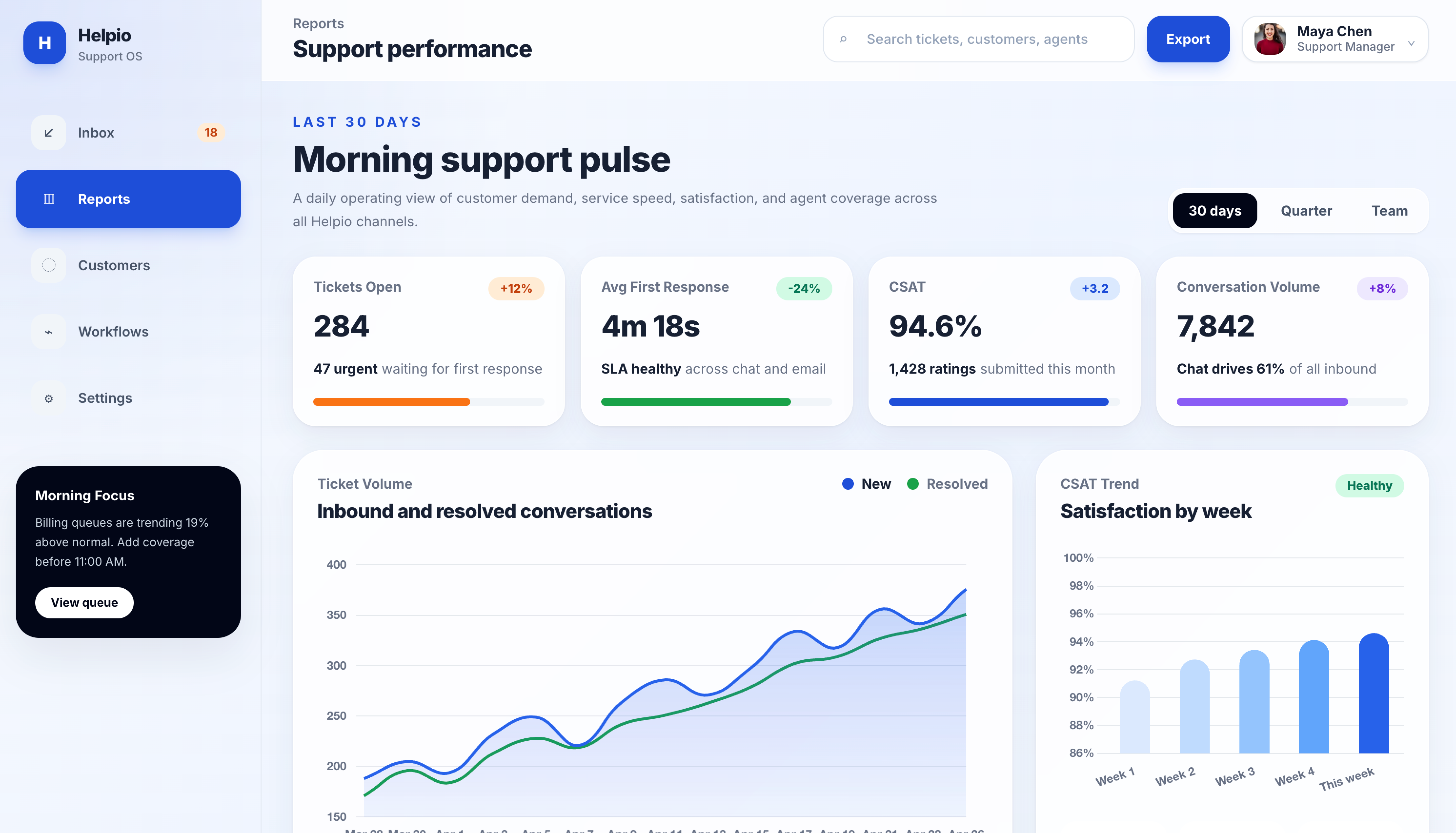
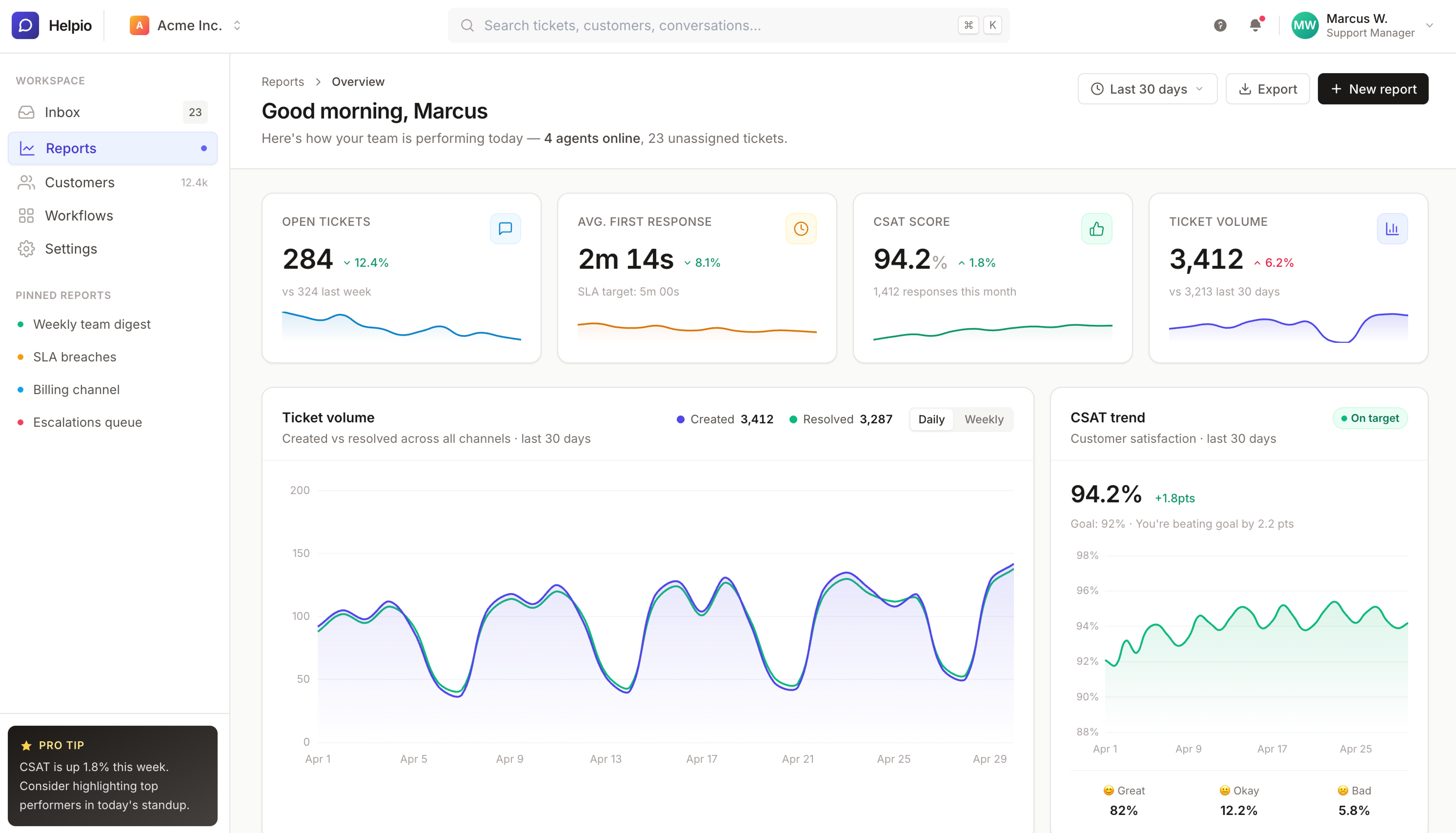
Dashboards are where restraint matters most. The job is to make the data readable, not to be the centerpiece.
GPT-5.5 made the centerpiece the headline (”Morning support pulse”), inflated the metric numbers, and used soft smoothed Bezier curves on the charts that look more decorative than informational. The active sidebar item is a heavy bright blue.
Claude Opus 4.7 went the other direction. The “Good morning, Marcus” header is muted and properly sized. Card spacing is tighter. Sparklines sit directly inside each metric card. The charts read as data rather than graphics. Right-aligned header controls (date picker, export, primary action) sit where you would expect them in a production dashboard.
This task had the widest visible gap of the five. GPT-5.5 leaned into hero typography and decoration, while Opus prioritized data legibility.
Task 3: Settings Page
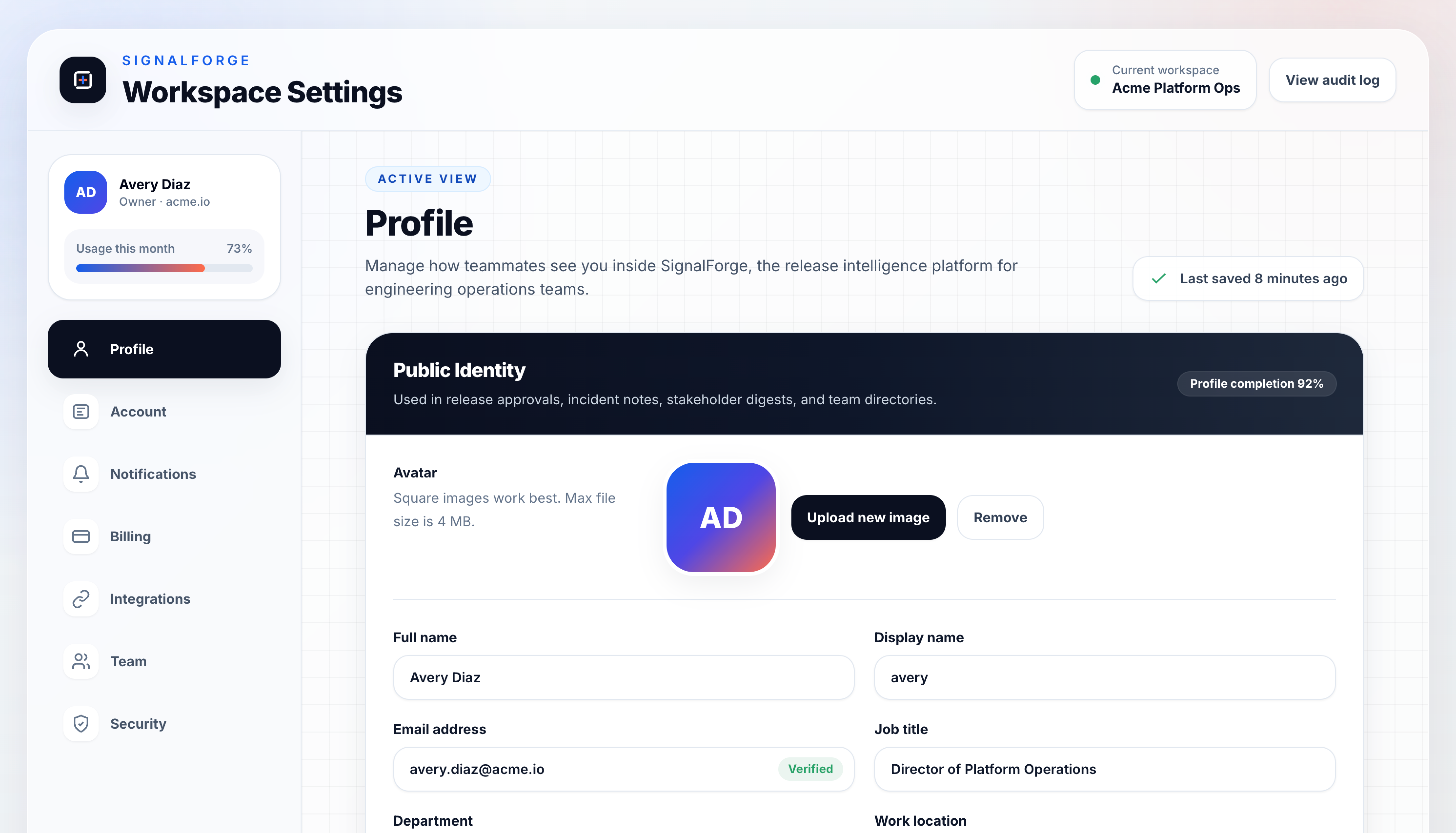
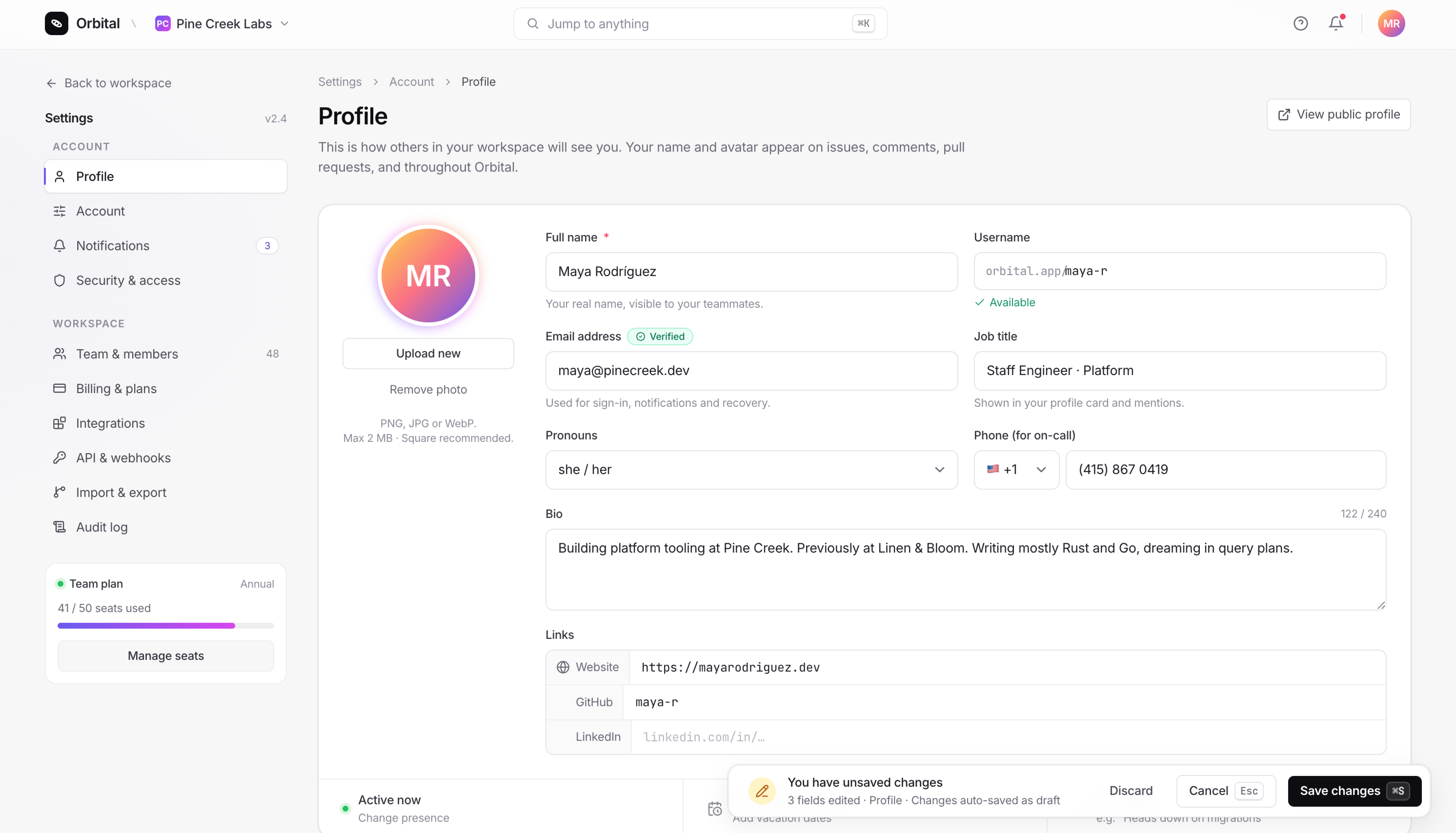
Settings pages need the most restraint. They are dense, they are utilitarian, and they should disappear.
GPT-5.5 added a grid pattern background, used a dark “Public identity” section header inside an otherwise light layout, and floated the user profile card above the sidebar nav. It also missed the prompt’s requirement for Save/Cancel actions, replacing them with a passive “Last saved 8 minutes ago” indicator.
Claude Opus 4.7 used the standard left-sidebar / right-content pattern, kept the gray palette quiet, and handled Save/Cancel with a floating “unsaved changes” toast pinned to the bottom-right (the pattern Linear uses). Small touches like a verified badge on the email field and a country code dropdown on the phone field added the kind of detail that pushes a UI from prototype toward product.
Task 4: Sign-up Screen
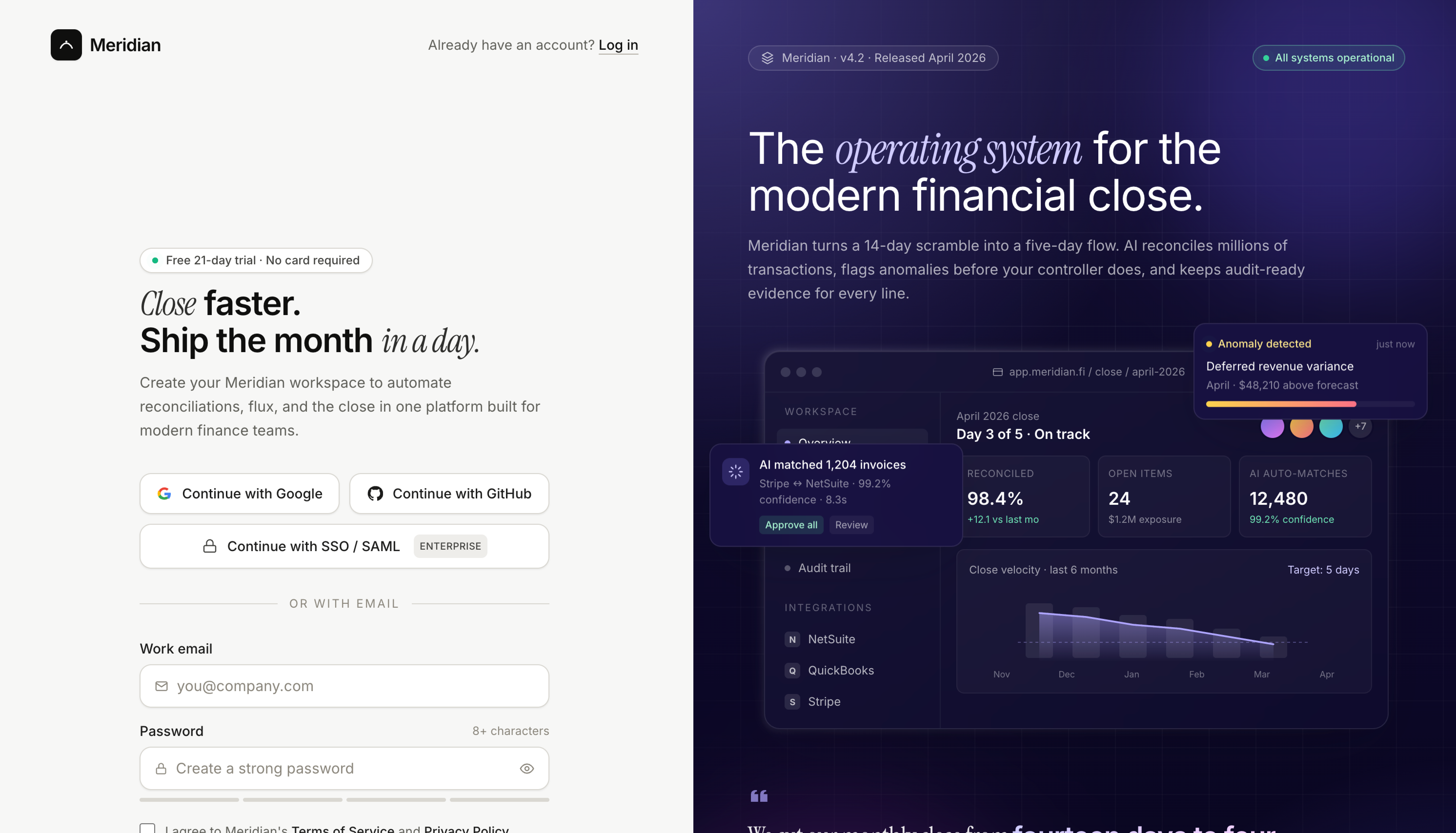
Both models reached for the split-screen pattern (form on the left, marketing panel on the right), which is what most modern B2B sign-ups look like.
GPT-5.5’s form is functional and clean but minimal. The right-side panel is a generic UI mockup. The page also missed the “log in” link the prompt asked for, which matters on an auth screen because users with existing accounts have nowhere obvious to go.
Claude Opus 4.7’s form is denser with detail: an “Enterprise SSO” button below the social auth options, icons inside the input fields, and the log-in link in its expected position. The right panel is a more developed product mockup with version and status indicators (”v4.2”, “All systems operational”). The headline (”Close faster. Ship the month in a day.”) uses the same italic-serif accent treatment Opus used on the landing page.
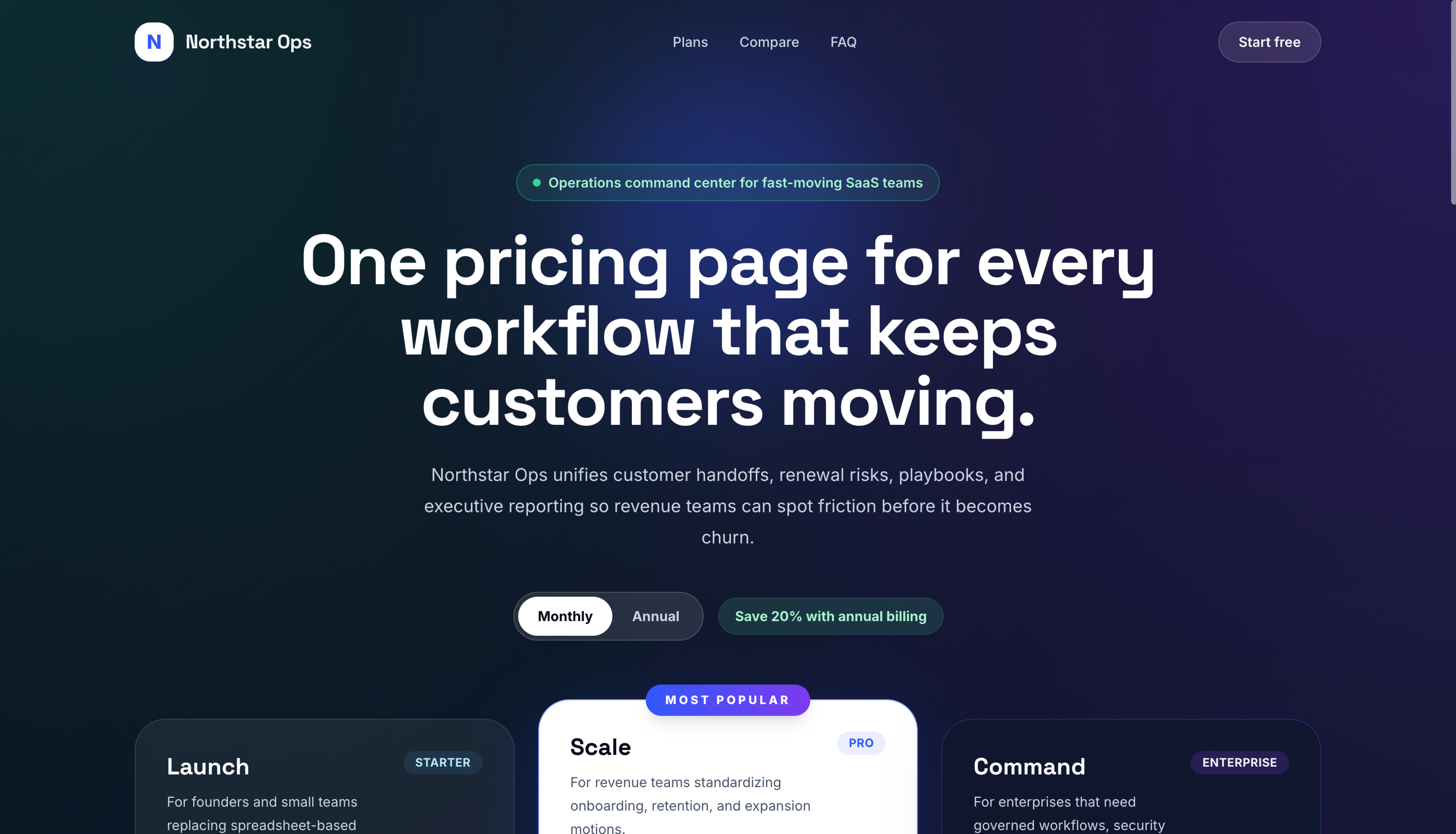
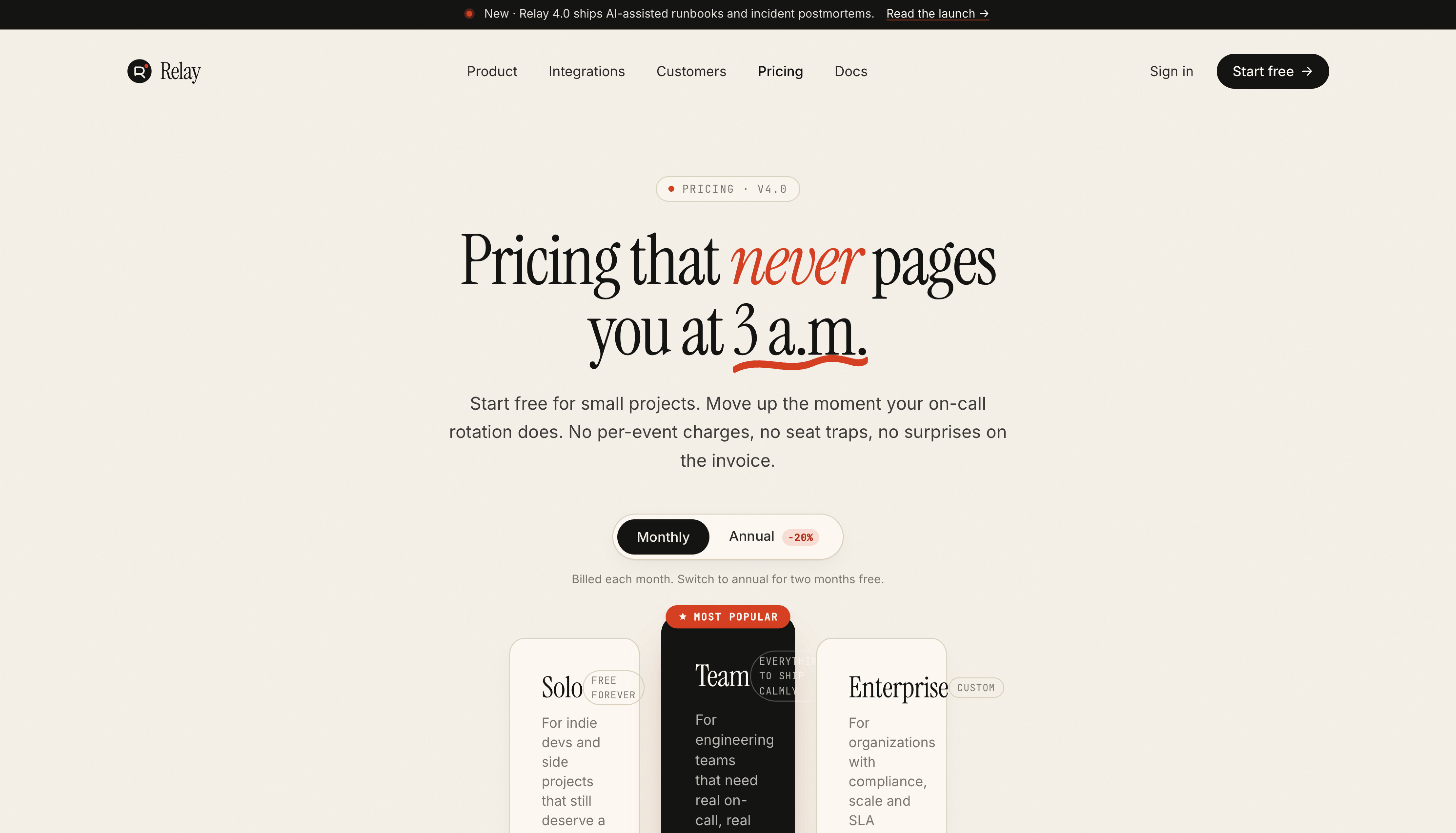
Task 5: Pricing Page
This was the closest task.
GPT-5.5 played the standard SaaS dark-mode pricing playbook: dark blue/purple gradient background, three tiers, the middle “Scale” tier flipped to white to draw the eye. It works. The annual toggle with “Save 20%” badge sits cleanly in the layout.
Claude Opus 4.7 took a riskier approach: a warm cream background with a charcoal middle tier pushed forward via z-index overlap. Italic-serif headline (”Pricing that never pages you at 3 a.m.”) with a hand-drawn underline SVG. The palette is more specific.
Opus’s pricing page is also the one visually broken output across all 10 runs. The card sizing didn’t account for the feature list length, and the text overflows the card edges in places. It’s a one-line CSS fix, but it shows the cost of the more ambitious layout. GPT-5.5 played it safer and shipped a working pricing page, while Opus reached further and broke slightly along the way.
Patterns Across All Five Tasks
Looking at the ten outputs together, a few patterns showed up across every task.
Claude Opus 4.7 has a wider design vocabulary. Its typography uses weight variation and italicized serif accents. Its shadows and borders shift across tasks (heavier on the landing page, restrained on the settings page, decorative on the pricing page). Its color choices are picked for the product (warm cream and orange for pricing, dark olive and chartreuse for landing, neutral grays for settings). The five Opus outputs feel like they could be from five different products.
GPT-5.5 reuses the same visual language across all five tasks. Every output uses sans-serif type at two weights, soft card shadows, a blue or purple accent on a dark background, and default Tailwind UI button and card styling. The five GPT-5.5 outputs feel like the same designer’s modern-SaaS template applied to five contexts.
GPT-5.5 missed three prompt requirements. It dropped the in-hero CTAs on the landing page, the Save/Cancel actions on the settings page, and the log-in link on the sign-up screen. Opus hit every prompt requirement other than the pricing card overflow. These are small details on their own, but they add up across the run.
Opus picks density per surface. Its dashboard is denser than its landing page. Its settings page is denser than its sign-up. GPT-5.5 used roughly the same density everywhere, which means the dashboard felt under-packed and the landing page felt template-bound.
Cost per Task
We ran each prompt in Kilo CLI Code mode at high reasoning. Costs are from Kilo Code’s run summary at the end of each task.
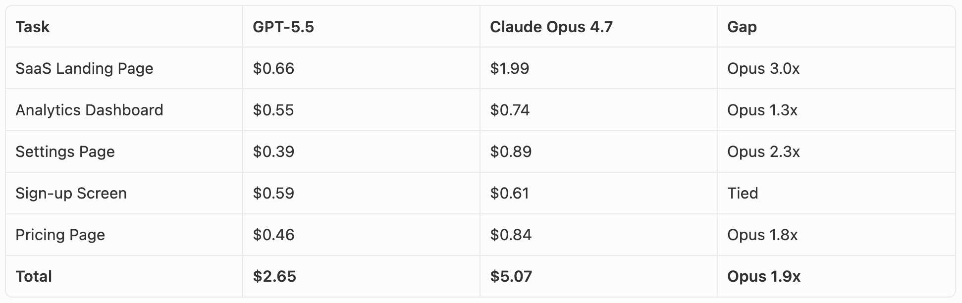
The per-token pricing suggests GPT-5.5 is the more expensive model: $30 per 1M output tokens vs $25 for Claude Opus 4.7. In practice it went the other way. Opus used roughly twice as many tokens on these tasks, which made it about twice as expensive overall ($5.07 vs $2.65 across all five). Opus’s longer reasoning and more detailed outputs are part of why it produced the more polished UIs, but they’re also why it costs more per task.
The widest gap was the landing page (Opus $1.99 vs GPT-5.5 $0.66). The closest was the sign-up screen ($0.61 vs $0.59). At absolute dollar amounts, the difference is small for a one-off prototype. At scale or in an iteration loop, it adds up.
Takeaways
Neither output is something we’d call ready to ship. Both would need a designer-engineer pass to fix details, refine spacing, and polish components. Opus’s pricing page would need its card sizing fixed before it could go live anywhere. GPT-5.5’s settings page and sign-up would need the missing prompt items added back in.
If we had to pick which set of outputs is closer to that final state out of the box, it’s Claude Opus 4.7. Across all five tasks, its outputs show better understanding of typography, color, spacing, and the small details that separate a prototype from a product. Each design feels picked for the prompt rather than applied to it.
GPT-5.5 has clearly improved at UI work. A year ago it produced UIs that read as obviously AI-generated. Today it produces UIs that read as “modern SaaS template.” The remaining gap (template to custom design) is the gap Opus has held for a while, and based on what we saw, it has narrowed but it’s still there.
For prototyping a real product surface that you intend to refine, the Opus output is a faster starting point. For greenfield mockups where the visual choices don’t matter much yet, GPT-5.5 is enough.
Cost is also worth noting here. GPT-5.5 charges 20% more per output token than Claude Opus 4.7 ($30/M vs $25/M), and for UI work specifically, that means a slightly higher bill for outputs that need a bit more cleanup before they ship.
FAQ
Is Claude Opus 4.7 better than GPT-5.5 at UI design?
Across our five UI design tasks (landing page, dashboard, settings, sign-up, pricing), Claude Opus 4.7 produced more polished output than GPT-5.5 on every task. The gap shows up most in typography, color choices, and small details like form field treatments and unsaved-changes patterns. GPT-5.5’s outputs were modern and functional, but they reused the same visual language across all five tasks (sans-serif at two weights, soft card shadows, blue or purple accents on a dark background) that read as a Tailwind UI starter template.
Is GPT-5.5 cheaper than Claude Opus 4.7?
Per-token, GPT-5.5 is more expensive: $30 per 1M output tokens vs $25 for Claude Opus 4.7 (input is $5 per 1M for both). In practice, though, Claude Opus 4.7 used roughly twice as many tokens as GPT-5.5 on our UI tasks, so the total bill per task came out higher for Opus. Across all five tasks, GPT-5.5 cost $2.65 and Claude Opus 4.7 cost $5.07.
Which model has the larger context window?
GPT-5.5 has a slightly larger context window at 1,050,000 tokens vs Claude Opus 4.7’s 1,000,000 tokens. For most coding workloads, the difference isn’t meaningful since both can hold an entire mid-sized codebase in context.
Did GPT-5.5 close the gap with Claude on frontend?
Partly. Sam Altman acknowledged at launch that GPT-5.5 still trails on frontend (his exact words: “we still get looksmaxxed on frontend a little but we IQmog hard now”). In our testing, GPT-5.5 has clearly improved over earlier versions, but still produces UIs that read as generic SaaS templates rather than custom-designed products. Claude Opus 4.7 still has the edge for open-ended UI work where visual taste matters most.
When should I use GPT-5.5 instead of Claude Opus 4.7?
GPT-5.5 makes sense when token cost matters (it tends to write less for the same task), when you need lower first-token latency, or for tasks where general reasoning matters more than visual polish (refactoring, terminal agents, long-running tool use). Choose Claude Opus 4.7 for UI design, frontend work, and any task where the quality of the final output matters more than the token bill.
Should I switch from Claude Opus 4.7 to GPT-5.5?
If you primarily build UI or frontend work, no. Claude Opus 4.7 still produces more polished output across landing pages, dashboards, and form-heavy surfaces, and the cost difference per task is small in absolute terms (a few cents to a couple of dollars per UI). If your work is more about backend logic, refactoring, terminal agents, or long-running tool use where token efficiency matters, GPT-5.5 is worth trying.
\
Nice article! Only missing some actual details about costs of each task. We know the price per token. That doesn’t mean they use the same amount of token for the same task.