
OpenClaw's UI Just Got a Quiet Overhaul
Dashboard, mobile, and terminal—the last two releases touched everything

I opened the OpenClaw dashboard Monday, and something felt different. Similar layout and structure, but everything just worked better. Smoother transitions on mobile. Fewer weird rendering glitches. Settings that made sense on first glance.
Then I checked the release notes. It turns out v2026.3.8 and v2026.3.13 landed a bunch of UI changes across the dashboard, mobile apps, and terminal. None of them are “headline feature” material. But taken together, they make OpenClaw feel more finished.
The dashboard got a navigation overhaul
The most significant change is the new mobile navigation drawer. On screens at or below 1100px, the sidebar now slides over as a drawer instead of just disappearing. There was also a gap in the old design between 769px and 1100px where the toggle visibility broke. That’s fixed now.
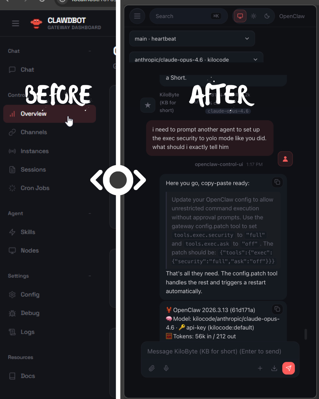
Beyond the drawer, contributor @BunsDev restructured the top nav and sidebar with a “brand eyebrow” — a persistent branding strip above the navigation. The chat model selection also got a proper picker with optimistic caching and rollback, so switching models mid-conversation feels snappy instead of janky.
A few other dashboard fixes worth calling out:
Chat history reload storm fixed (#45541): If you’ve had the dashboard freeze up during tool-heavy agent runs, this was why. Every live tool result was triggering a full chat history reload. Now it only refreshes persisted history on the final event.
Oversized replies are readable again (#45559): Long plain-text replies used to get crammed into capped gray code blocks. They render as normal paragraphs now.
The “New messages” pill stopped being giant (#44856): A CSS class got dropped, causing the scroll pill to render as a full-screen SVG overlay. Subtle bug, visible consequence.
Control UI auth works on plain HTTP (#45088): Shared token and password auth on LAN or reverse-proxy setups was silently dropping before the WebSocket handshake. If you run OpenClaw behind a proxy without TLS termination on the internal leg, this one matters.
Android: denser, cleaner settings
The Android app got a redesigned chat settings sheet from @obviyus. The changes are practical: endpoint and status merged into one grouped card with icons, context-aware connect/disconnect buttons, role labels renamed to “You/OpenClaw/System” instead of the old generic names, and streaming labeled as “OpenClaw · Live.”
The old settings view had nine sections. The new one has six. Node info lives in a single Device card, permissions are grouped into Media/Notifications/Data Access cards, and Screen+Debug got combined into Preferences. It’s the kind of cleanup that only matters once you notice how cluttered the old version was.
They also swapped the QR scanner to Google Code Scanner for onboarding, replacing the legacy embedded flow.
iOS gets a proper welcome screen
New iOS users used to get dumped straight into the QR scanner the moment they opened the app. That’s not great as a first impression.
The new welcome pager by @ngutman adds a first-run flow before gateway setup. It stops auto-opening the scanner and shows /pair qr instructions on the connect step. Small change, but it means people actually know what they’re looking at before being asked to point their camera at something.
The terminal learned about light mode
This one’s for the “light theme” holdouts. The TUI previously assumed dark backgrounds, and its colors were nearly invisible on terminals with light themes.
PR #38636 by @ademczuk added auto-detection of light terminal backgrounds via COLORFGBG, with proper sRGB linearization and WCAG 2.1 contrast ratio calculations. It picks whichever text palette, dark or light, has higher contrast against the detected background.
If auto-detection doesn’t work for your setup, there’s a manual override: OPENCLAW_THEME=light or OPENCLAW_THEME=dark.
I run a dark terminal, so I didn’t notice this myself. But if you’ve ever squinted at faint text in the OpenClaw TUI, that’s what this fixes.
Community effort
Most of this UI work came from community contributors, and it shows in the breadth. @BunsDev alone shipped the mobile nav drawer, sidebar polish, chat rendering fixes, and several layout improvements. @obviyus did the Android redesign and QR scanner swap. @Astro-Han caught the scroll pill regression. @ademczuk built the light theme detection.
The v2026.3.13 release alone had 22 new contributors making their first PRs. People aren’t just filing issues. They’re shipping interface improvements.
The takeaway
Individually, these are all small fixes. Together, they add up to a version of OpenClaw that just feels more finished. The dashboard is tighter on mobile. The Android app respects your screen space. The terminal works on light backgrounds. The Control UI stops silently dropping your auth.
If you’re on an older version, the OpenClaw update is worth it for the UI improvements alone. And if you want to update your KiloClaw instance, that’s even easier - just click “Redeploy & Update.”