
Grok Build 0.1 Website Experiments: Round Two

Yesterday, we shared 5 websites we built in Kilo Code with Grok’s new model: Grok Build 0.1.
The model is pretty good at creating websites from scratch, and people seemed to enjoy the examples, so we decided to put together a follow-up post with 8 new, additional examples.
This time, we tested how well Grok handles interactivity, design, and humor. We also looked through the source code to see whether and how it actually worked under the hood.
Let’s play a game of parrots
The prompt, total cost, and token spend:
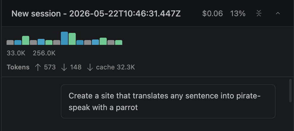
The result: This was a dark-mode, modern website, and the interactivity all held up. The parrot animated on click, the speech bubble appeared and faded out cleanly, copy-to-clipboard worked with a graceful fallback for older browsers, and the speech synthesis call fired with pitch and rate tweaked to sound parrot-ish.
A website to book a hotel on the Moon
The prompt, total cost, and token spend:
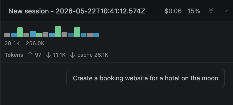
The result: We got a functional website. Grok also invented the phrase "view of forever" for the suites section headline. We didn't ask for it. The model decided a moon hotel needed that. The three-stop gradient (purple, blue, cyan) is clipped to the headline text, layered over a dark space-themed background.
Try this prompt + the rest in Kilo Code
An interactive Pomodoro timer
The prompt, total cost, and token spend:
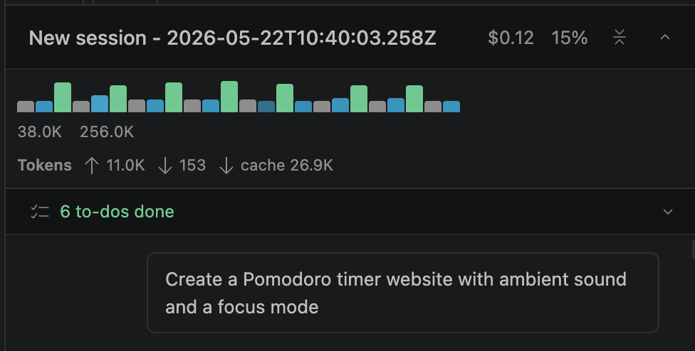
The result: The timer behaved correctly through every state transition. The Pomodoro logic handled the full loop: start, pause, resume, reset, completion chime, and auto-advance to the next phase. The code correctly implements the full Pomodoro loop, including a long break after every fourth focus session
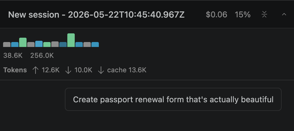
Beautify a government website
The prompt, total cost, and token spend:
The result: The multi-step workflow worked end to end:
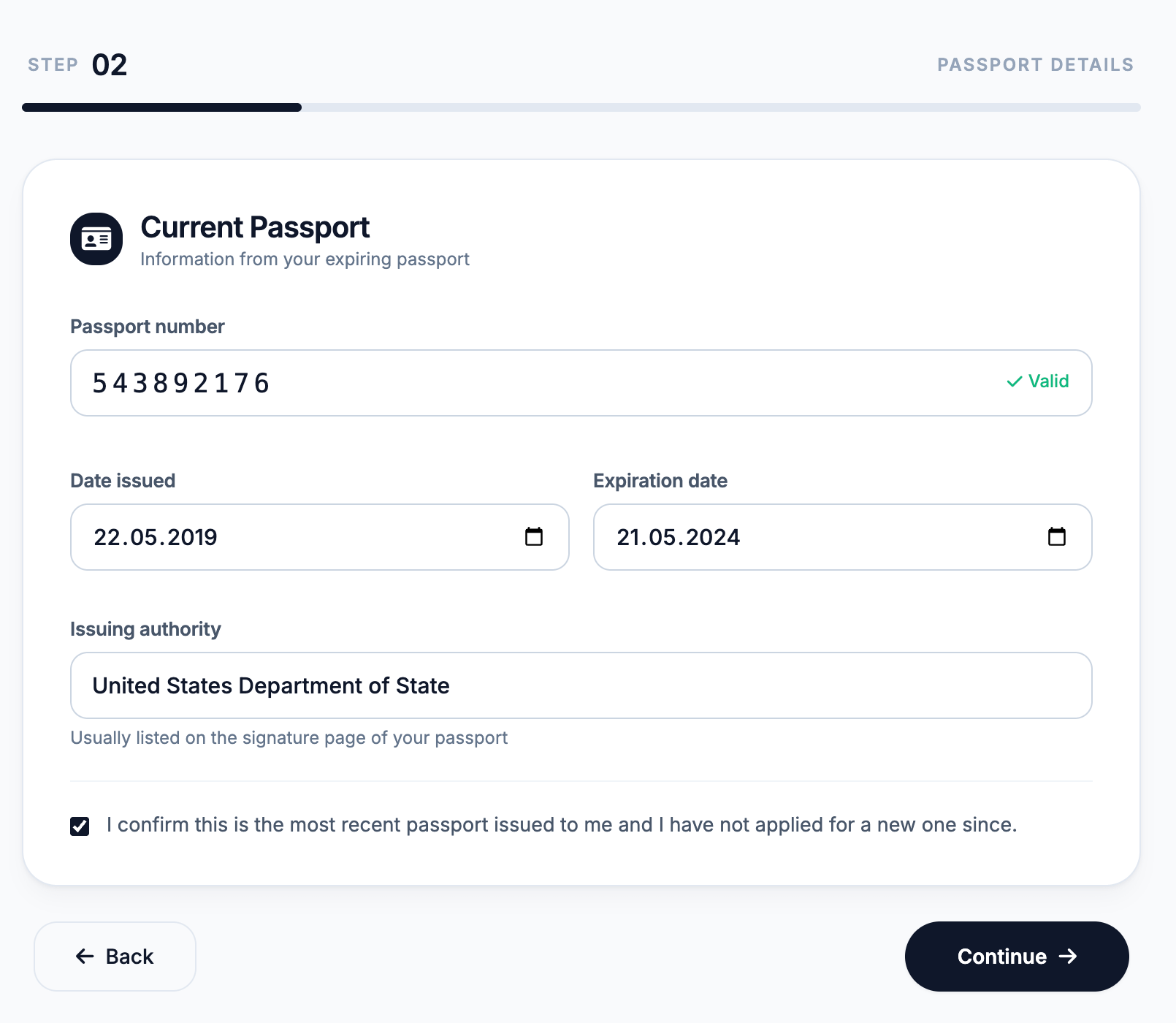
The five-step form swapped sections cleanly, the progress bar advanced with the step count, and the Continue button correctly switched to "Submit Application" and changed color on the last screen.
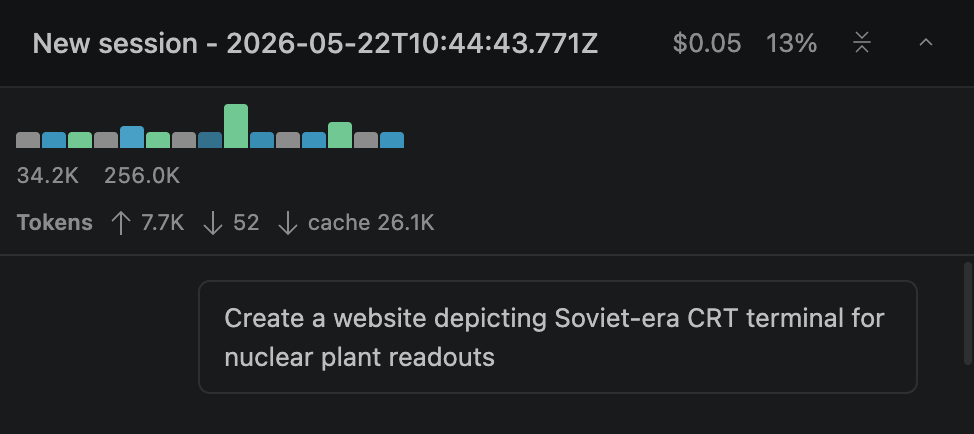
Experimenting with old-school interactivity
The prompt, total cost, and token spend:
The result: We got the look we wanted: every interactive piece behaved like a small simulation rather than something static. The CRT effect is doing real work: phosphor glow via text-shadow, repeating scanlines, a sweeping highlight band running top-to-bottom on a CSS animation, a subtle flicker on opacity, and a radial vignette layered on top to fake the screen curvature.
Try this prompt + the rest in Kilo Code
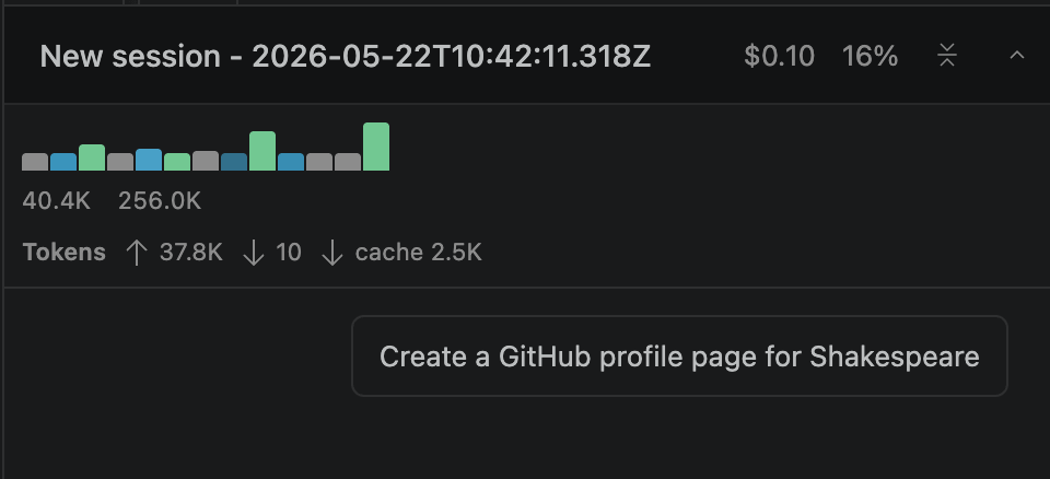
A GitHub profile page for Shakespeare
The prompt, total cost, and token spend:
The result: This looked like an actual GitHub page. Follow toggled between the green Follow state and the gray Following state, and the follower count incremented and decremented to match. The sponsor flow opened a modal, let you pick a tier (Bronze Quill, Silver Sonnet, Gold Globe), and swapped its own contents to a thank-you screen on submit.
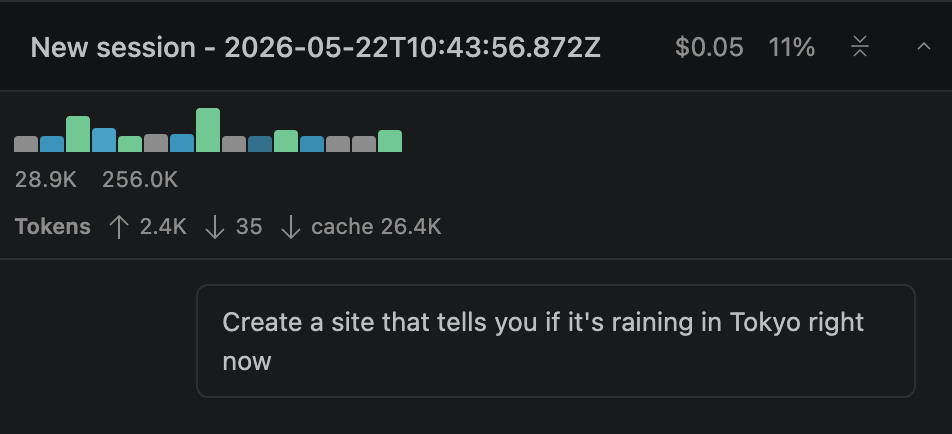
Is it raining in Tokyo right now?
The prompt, total cost, and token spend:
The result: We were aiming for functionality here, not design (although the site looked quite decent). The live data fetch worked. The app hit Open-Meteo's free forecast endpoint with the right Tokyo coordinates and a sensible parameter list (weather code, temperature, precipitation, rain, humidity, cloud cover, wind, timezone set to Asia/Tokyo), then mapped the WMO code into three states: heavy rain, light rain, and no rain, with separate icons for each.
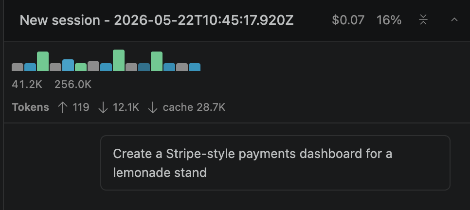
A payment dashboard for a lemonade stand
The prompt, total cost, and token spend:
The result: The site looked modern and pretty much every interactive piece held up.
Sidebar navigation switched sections without reload, the Today / 7 days / 30 days buttons recomputed the metrics and rebuilt the Chart.js line graph on the fly, and the status filter pills on the payments view narrowed the table as expected.
You can run these prompts yourself by installing our VS Code extension or using the Kilo CLI. For this round of examples, we used the VS Code extension together with the built-in Agent Manager.