
519 Developers Competed to Build the Worst Website Ever.
They Did Not Disappoint.

Last week, we ran a simple contest: use Kilo’s App Builder to create the absolute worst website you can imagine. No rules. No taste. No mercy.
519 developers entered. The results were horrifying - we loved every single one.
Developers Are Truly a Different Breed
Here’s something that’s been true since the first person opened a text editor: there are a limited number of ways to make something good. There are restrictions - some call them best practices - when you design with user experience in mind. But there are so many ways to make something bad. When you ask developers (who have a curious knack for ironic suffering) to lean into this, the creativity unlocks, and the passion ignites. The CSS crimes begin.
There’s something deeply revealing about this. When you remove the pressure to be impressive, sometimes people actually get more creative. Nobody’s thinking about conversion rates or above-the-fold content. They’re thinking “what if every button just made things worse?” And honestly? That development can be a lot of fun.
It’s 2026 and the discourse around AI and coding has taken center stage. Everyone is asking important questions about what it means for the future of coding. Meanwhile, 519 people spent their weekend trying to make a website that psychologically torments its users, and they had the time of their lives doing it. Development is still fun. Turns out the robots can help with that too.
The Top 3 (Bottom 3?)
We had a brutally difficult time judging these. But after much deliberation and several episodes of rage, here are the winners. Or losers. Depends on your perspective.
🥉 Dr. Tooth (visit here)
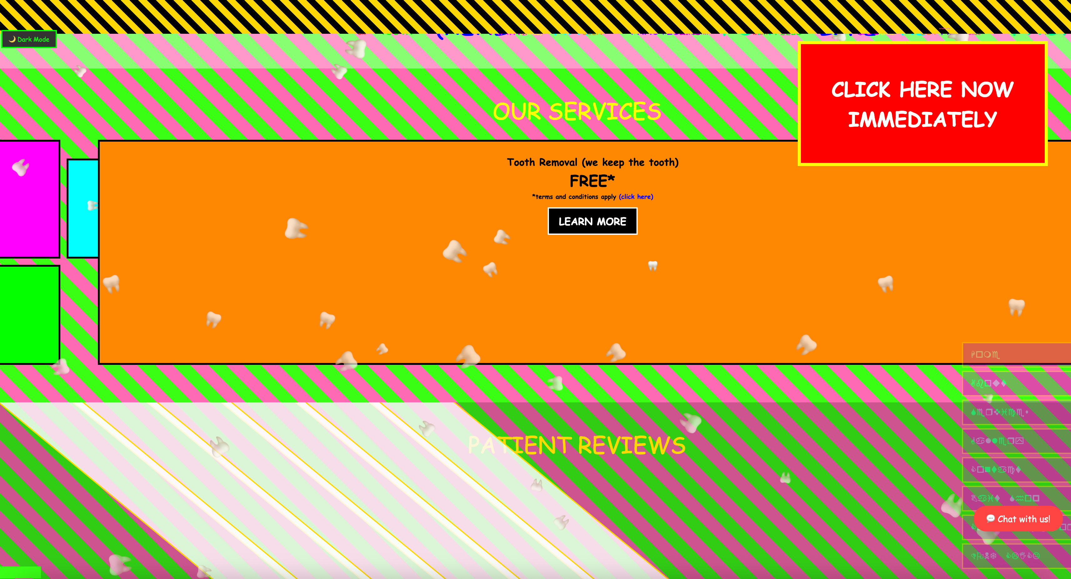
We need to talk about Dr. Tooth.
It’s a dentist landing page. On the surface, that’s normal. But something is deeply wrong. The color palette is unsettling in a way that’s hard to articulate. There’s electronic music playing that sounds like it was composed inside a cavity. Your cursor? It’s a tooth now. You didn’t ask for that, but here you are, navigating a dental website with a molar.
Dr. Tooth doesn’t want to clean your teeth. Dr. Tooth wants you to feel something. What that something is, we’re still processing. The developer managed to hit that perfect uncanny valley between “professional service website” and “something you’d find on a cursed corner of the internet at 3am.” We’re genuinely a little afraid of this one.
🥈 The “Best” Website Ever (visit here)
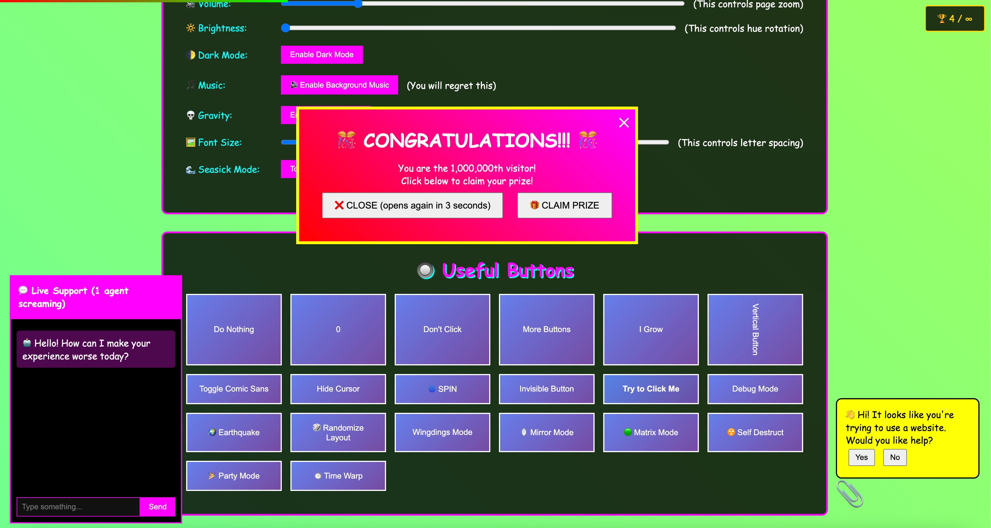
This one came in as a landing page that appeared to be a somewhat uniform submission for approximately 0.3 seconds before you notice the buttons. There’s a “Mirror” button that flips the entire page. A “spin” button that does exactly what you’d expect but way more aggressively than you’d want. One button just says “This Button Gets Bigger” and, reader, it does.
It’s like someone built an interactive museum of bad UX decisions and gave you a ticket. Every click makes the experience measurably worse, and you cannot stop clicking. The developer understood something fundamental: people will press every button on a page if you make the labels weird enough.
🥇 The Worst Signup Form Ever Created (visit here)
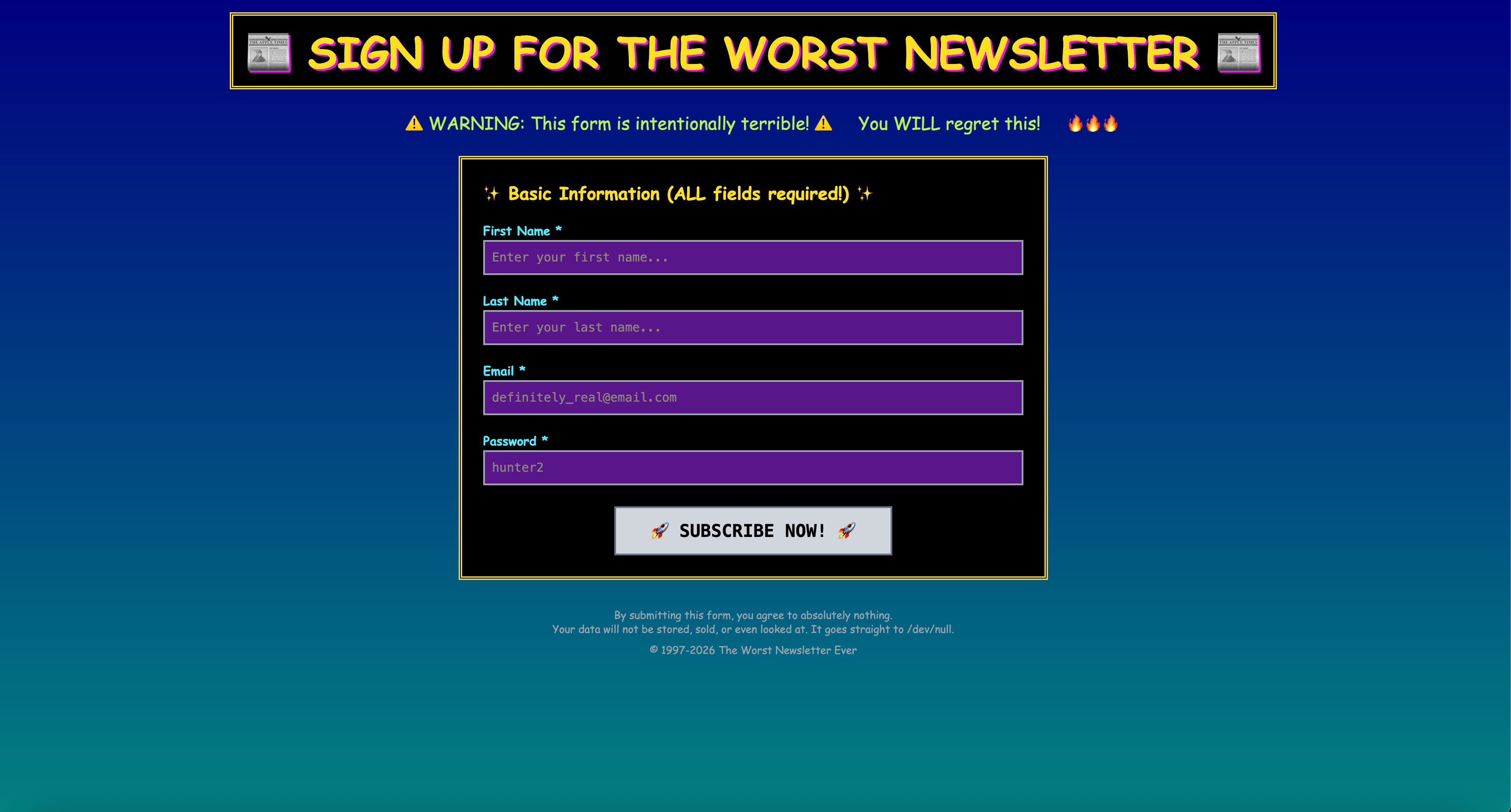
You know those signup flows that ask for one more thing before you’re done? This developer took that concept and turned it into a Kafka novel.
You enter your email. Great. Now it wants your mother’s maiden name. Fine. Now it needs your least favorite color. Now it’s asking for your SAT score. Now it wants to know your feelings about ranch dressing. Every single field you fill out spawns a new, increasingly unhinged form. The submit button is an illusion. The is end is near but never here. There is only the form - and suffering.
The terrifying part? It’s built well. The state management is clean. The escalation is perfectly paced. This person clearly put real engineering effort into making something that should never exist. That’s the spirit.
Vote for Honorable Mention
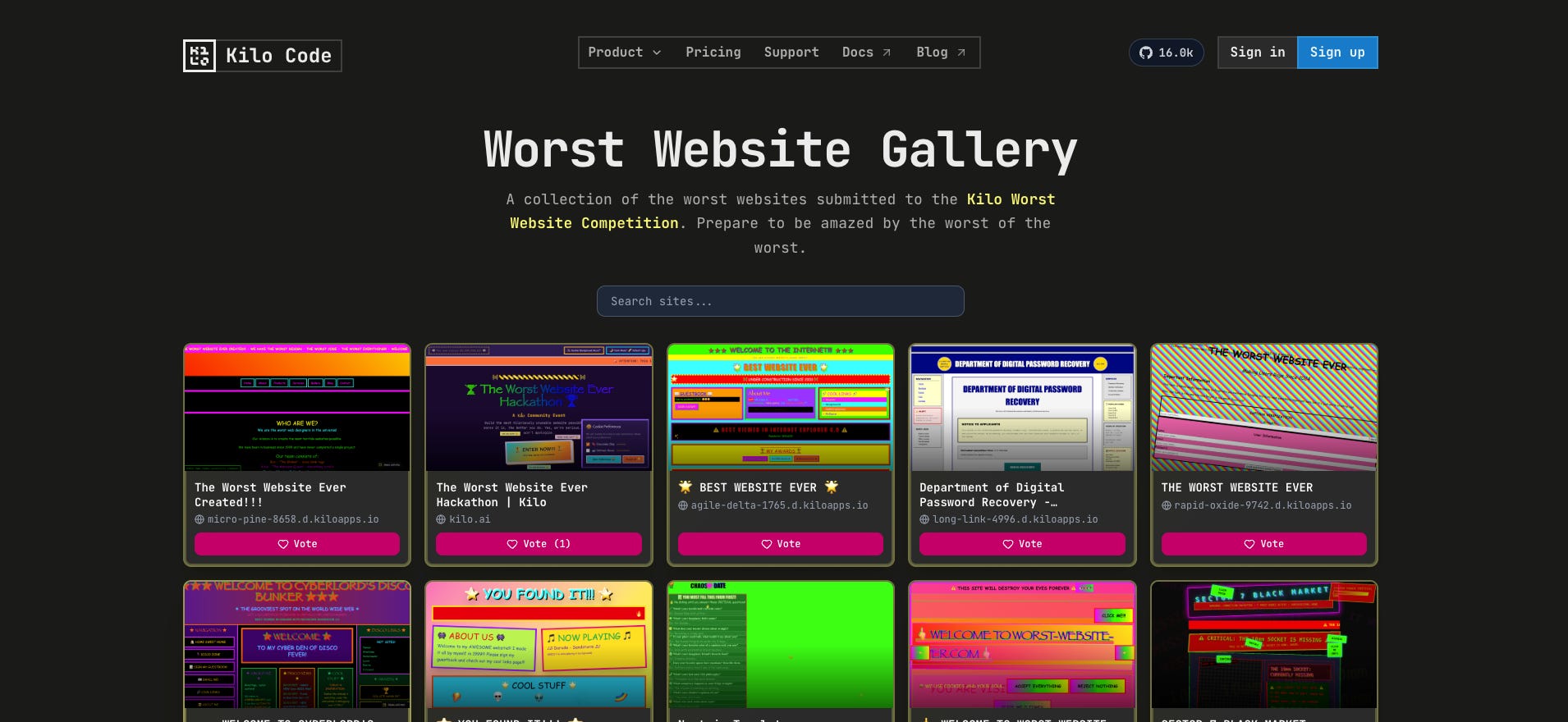
This contest isn’t quite over yet - there was just too much gold (or dirt) in the mix to cap it three. You can view all 519 submissions, and vote for your favorite, here:
The project with the most votes by Wednesday, March 4 will get $300 in Kilo Credits.
Kilo’s App Builder
Every single one of these 519 entries was built in Kilo’s App Builder. That means these developers went from “what if a dentist website was a horror experience” to a live, deployed, shareable site without ever leaving the browser. No local setup. No deploy pipeline to wrestle with. Just an idea, a prompt, some iteration, and a one-click deploy.
App Builder was designed for building real apps and sites fast. But it turns out it’s equally good at building deeply cursed ones fast. The same features that let you spin up a SaaS landing page in minutes also let you create a signup form with no end and a tooth cursor in minutes. The tool doesn’t judge. It just ships.
And that might be the actual takeaway here. The best way to learn a tool, to really feel what it can do, is to play with it. Not every project has to be a portfolio piece. Sometimes the most productive thing you can do is build something stupid with your whole chest.
Build Something Terrible (or Great)
If you missed this contest, don’t worry. App Builder is right there waiting for you at app.kilo.ai. Go build something awful. Make a website that plays a different animal sound every time you scroll. Make a portfolio site where every project is a lie. Make a button that just says “Don’t” and see what happens when people click it.
Development is supposed to be fun. 519 developers proved that last week, and the tool that let them do it in an afternoon is free to try.
We’ll be running more of these. Stay tuned in our Discord for the next one.
Now if you’ll excuse us, we need to go schedule a dentist appointment. A real one. Not Dr. Tooth.
Lovely awful websites, well done!